Nuubi
Generating student success via gamification of peer learning
Role
UX/UI Designer
Project Duration
Sep. 2023 - Dec. 2023
Background
Nuubi is an application that promotes student peer to peer learning. It operates on two primary features of live chatting and posting, in which students are incentivized to engage with one another to earn points in their groups.
I joined the Nuubi team as part of an internship program for 3 months, where interns were split into various categories of building Nuubi UX/UI. There was the Onboarding team, the Groups team, the Account team, and the Gamification team.

I joined Nuubi as a UX/UI Design Intern for the gamification element of the app.
Achievements During the Internship
When I joined Nuubi as a UX/UI Design Intern, Nuubi had just started its first internship program, so we were the first to work with them as a newer company. Given that, during my time at Nuubi, I worked on a team of 4 for Gamification, and some key accomplishments were:
Perform competitive analysis & determine existing Gamification elements in competing products
Ideate Gamification elements for Nuubi, and how such elements would work as user flows
Sketch & refine Gamification elements for wireframing and prototyping
Create wireframes for Gamification of Nuubi, & iterate upon feedback between members
Perform usability testing to better align Gamification elements with user interests
Bring wireframes to hi-fidelity, and create a final interactive prototype as final deliverable
Researching the Competition
Before jumping straight into ideating and designing gamification elements for Nuubi, I worked with the Gamification team to perform competitive analysis of competing products. The purpose of this research was to determine what forms of gamification are currently being used, and how we may incorporate gamification into our own work.

Personally, I looked into Discord and Study Together, both direct competitors in the online communications category. Main takeaways were:
Discord

Study Together

Discord made use of subscriptions to enhance user presence, and roles to mimic guilds in MMO-type games. Study Together, on the other hand, made use of timed challenges, reputation, and progression trackers (levels). My research found similar results to my teammates, where InScribe and Duolingo, for example, also made use of points and levels.
After discussion amongst the team, we decided to start with these initial gamification elements: a points system, a leaderboard system based off of those points, a daily tasks system, and a badges system.
Designing a Solution: Breaking It Down

Daily Tasks
Leaderboard
With a starting point for our gamification elements, our team first decided to lay out sample user flows, as well as begin sketching how some of those flows may look like. For example, the possible user flow of completing a ‘Create a Post’ daily task.
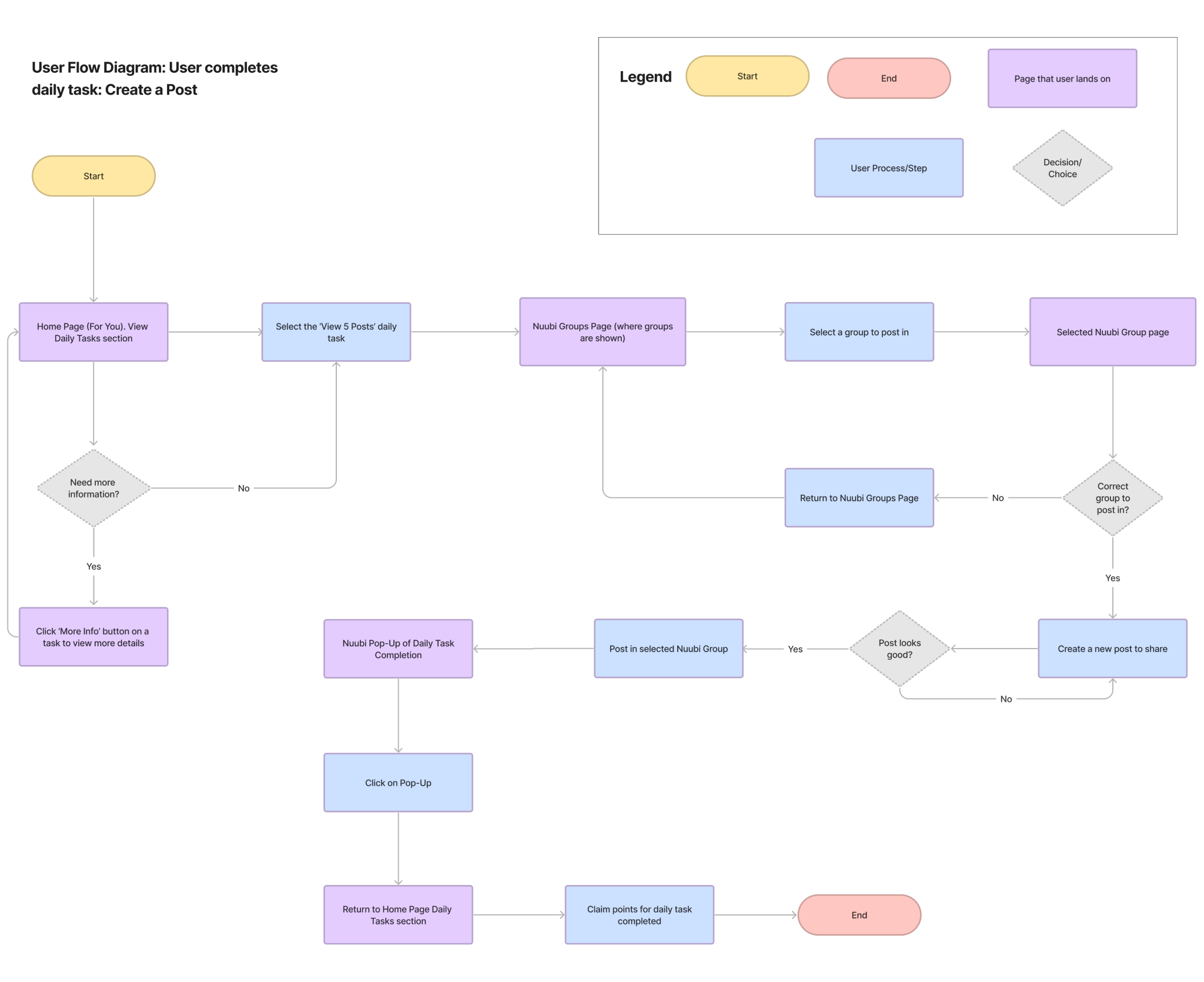
Following user flows, we then started sketching out different user flows such as completing a daily task, and viewing a leaderboard. Wireframe sketches framed as user flows would help better visualize the steps a user has to take, and whether there are any flaws in navigation. Each Gamification team member sketched out wireframes for the different gamification elements, and we would then receive and provide feedback amongst ourselves.


Badges

Amongst the team’s wireframes, there were many shared similarities in how the gamification elements were laid out/presented, largely because majority of the team was familiar with video games, and how such elements are typically shown. The Daily Tasks and Leaderboard were easily accessible from the ‘home’ For You page, there was a dedicated Tasks page, and a dedicated Leaderboard for each group. Moving forward, we decided to focus largely on 3 elements to iterate on: Daily Tasks, Leaderboard, & Badges.
Designing a Solution: Tasks
The Daily Tasks feature was one of the features the Gamification team worked on. A brief description of what the Daily Tasks entail:
Daily ‘tasks’ that users are presented in order to earn points in Nuubi
Daily cap for amount of possible points to gain
Tasks are meant to be simple and easily completed, to encourage engagement with the app
Daily usage encourages users to return on a somewhat frequent basis to earn points in Nuubi, and thus gain a higher position in the leaderboard
Weekly tasks are also available, presented as more difficult tasks that can earn higher amounts of points
Later renamed to ‘Tasks’ to account for daily/weekly
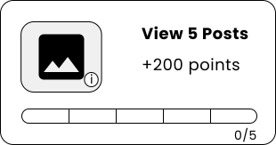
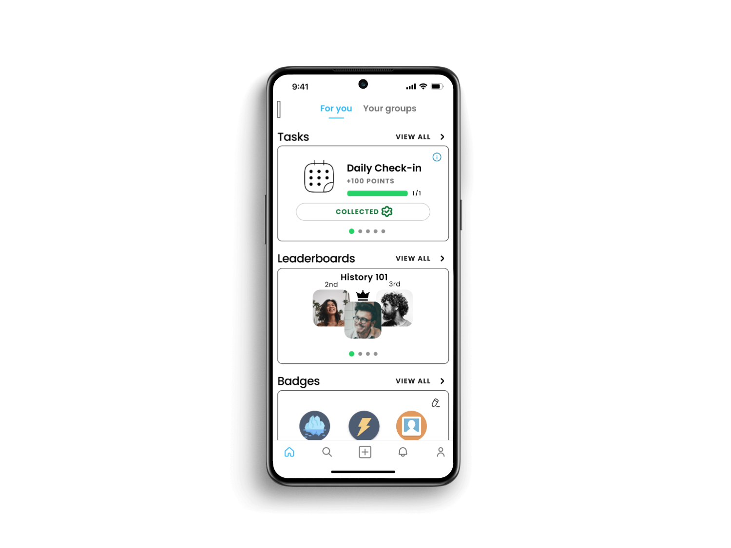
For the initial design of how the tasks were presented, I decided to make a card component that holds a single task. The content, generally speaking, would be an icon/visual representing the task, the task title, the point value, and the progress towards completing the task. In order to avoid clutter, users would be able to click on the image to view a description of how to complete the task. This is how the tasks would be presented on both the ‘For You’ page and the Tasks page. The only difference would be that the ‘For You’ page card is visually stacked, so as to indicate multiple tasks to swipe through. I did not include a CTA button because the plan was for daily tasks to auto-complete with a modal popup, so as to ease the user’s necessary clicks.

To help users keep track of their progress in their Daily Tasks, they would be able to view an overarching progress bar for the day until they maxed out daily possible points, as well as a mini progress bar within the card for individual task progress.
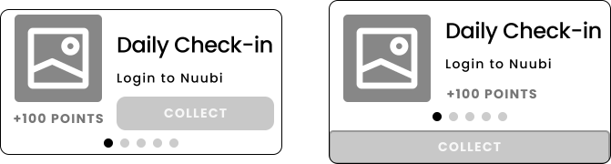
I reviewed my initial iteration of the Task card with my group, and created new versions of the card based on our discussion. My team felt that the progress bar for the task was unnecessary for the user to view, given that the tasks were relatively simple at this time. Thus, we A major discussion point was the inclusion of a CTA button, and the idea was: a modal popup may be more convenient for the user to gain their points, but a CTA ‘COLLECT’, on the other hand, engages the user more often in the tasks that they’re doing. Thus, we decided to move forward with a CTA ‘COLLECT’ button to promote greater interaction from users with their tasks.

For the final 2 iterations of the task card, we mostly tried rearranging the layout of the card, doing things such as making the icon smaller, changing placement of items, and resizing the ‘COLLECT’ button.
For the final task card iteration, I suggested creating a medium sized button that is a layer below the rest of the card content for visual clarity. The ‘COLLECT’ button would be enlarged enough to easily click, and we re-implemented the progress bar for a task for visual indication.
The task card’s final iteration

While designing the gamification element of Tasks, we decided to include the idea of Streaks. At first, we thought of Streaks to maybe just be the user logging in every day to continue their streak. However, to increase engagement with the app, we decided to revolve the Streaks around the Tasks feature. This would ensure that users are actively using the app, rather than just logging on to maintain their streak.
Users can gain a streak for the day by completing at least 2 tasks
Users can earn points for maintaining streaks for a certain number of days

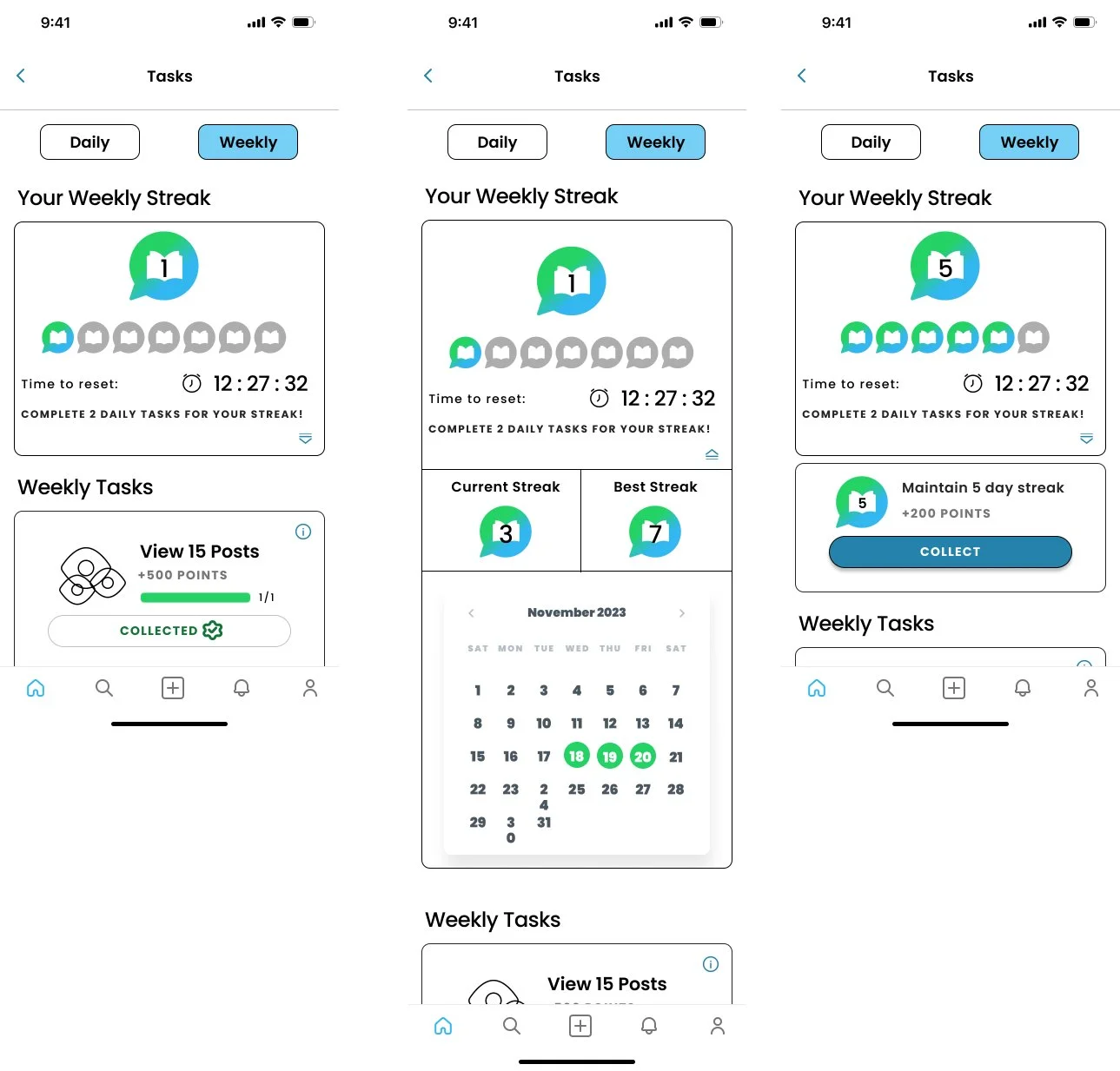
In the initial designs for the Streaks, we simply had a visual tracker of how many days the user was on a streak for. However, as we went to hi-fidelity wireframes, we made the UI more visually apparent of the user’s current streak status, adding things such as a calendar, current streak & best streak, and upon reaching the required amount of streak days for a reward, they are able to collect.
Designing a Solution: Leaderboard
The Leaderboard feature was another aspect of gamification our team worked on, largely revolving around the points system:
Users can gain points via daily tasks, weekly tasks, & streaks
Users are ranked according to the number of points they have total, in each group that they’re part of
The existence of leaderboards is meant to encourage users to participate in a competitive aspect of Nuubi, engaging in core features of the app (live chatting, answering questions)
When designing the Leaderboard system, the core design was quite simple: a way to show users in a group who has how many points, and where they place amongst their peers. Our primary challenge was to figure out a user interface that was easily navigable and intuitive to the user.
Iteration 1


Iteration 2
Iteration 3 (Hi-Fi)
The Leaderboard feature has its own dedicated page, and as mentioned, our biggest design challenge was figuring out how to make a user interface that satisfies the user. In my first iteration of the design, I created a typical leaderboard, with the rankings of the top 3 presented visually larger, then a list-style leaderboard for the rankings top-down. Beyond that, I came up with the idea of a ‘quick-summary’ card at the top of the Leaderboards page. My thought process was, ‘users will want to see what their rank is quickly when clicking on this page, as well as their relative position to their peers’. Thus, it should be quickly accessible upon opening the page. This was an idea that our team liked, and went through with to the final designs. Beyond that, me and my team made pill-style tabs to click and scroll through for the various groups a user may be part of, and an ongoing debate was the implementation of a search bar. The argument was that users may want to search for specific users in a class, so for now, it was kept.

Leaderboards Final Iteration
Upon bringing our Leaderboards feature to its final iteration, the major changes we decided to make were that we removed the search bar. The search bar was found to be too time-consuming for the first implementation of Nuubi, and upon further inspection, we recognized that even within a group, considering a group is a class of students, there is typically no more than 30-100 students in a college class, which thus does not justify a search function for now. Beyond that, the UI stayed mostly the same as Iteration 3, with a quick-summary card for the user’s current ranking in a group, highlighting their position. The top 3 users in the group are displayed, then a draggable list of the rest of the leaderboard is below that. A final decision that we made was whether upon opening the page, should users see the expanded summary card first, or the collapsed? I felt that in a user scenario, if they were want to check their leaderboard position for the first time in a day, it’d make sense to get a good, overall look at their entire ranking. Thus, the expandable card. We also decided to allow users the option to manually expand or collapse the card, depending on their preference.
Designing a Solution: Badges
The Badges feature is the last primary gamification element of our initial version of Nuubi. Badges are designed to be various achievements that users can earn simply by using the app:
Users can earn badges by using the Nuubi app and completing certain achievements (for example, ‘Send your first message in any live chat’)
Upon receiving a badge for an achievement, users can receive points for the badge
Badges are for those who are completionists, encouraging users to explore every nook and cranny of Nuubi and what you can do in the app
When designing the Badges system, the core idea was pretty simple: Badges are achievements that users are able to get by using the app. Our main design challenge was figuring out what badges should be included, and this meant determining the difficulty of achievements, how many points to give for a badge, and how can we ensure badges represent Nuubi’s full versatility in peer-to-peer learning interactions.
Before fleshing out what kind of badges should be included, we first designed the layouts for where the badges would be placed. Badges would be primarily accessible through the Profile page, leading to a dedicated Badges page. I also came up with the suggestion to show a user’s ‘top 3’ badges, which could be the top 3 most recent achievements, or their personal selected favorites.

All of our layouts for the Badges feature was relatively the same, so we went ahead and created hi-fidelity versions.

Badges Final Iteration
As for the contents of the badges themselves, we discussed as a team what kind of badges we should have. What we ended up doing was, we split the badges into 3 different categories: Social, Discussion, and Leaderboard. We felt that we wanted to categorize somewhat based off of what Nuubi encourages, which is to engage in the avenues of discussion in the app and interact with peers.

Final Deliverable: Nuubi Gamification
Click phone to view prototype
The final deliverable that the Gamification team turned in for Nuubi was 3 separate hi-fidelity interactive prototypes, each one created by a member of the team. Our initial plan was to consolidate on a single final version, but after further discussion, we felt that as the first batch of interns for Nuubi, it would be more beneficial to provide more variety in our final deliverable. This would give future interns more ideas to work with.
Reflection on the Internship
After completing this 3 month internship, I felt that as my first UX/UI Design internship, I was able to greatly familiarize myself with working in Figma, and in a team of UX/UI designers. Previously, I hadn’t had much experience in practical Figma work, so this was a great growth point for me.
During this internship period, I was able to learn how other designers thought when making design decisions for different elements of the UI, and I think this really helped provide a new perspective for me in UX/UI, as well as pick up angles to look at designing.
As for the actual Nuubi Gamification work, I am very satisfied with the final prototype deliverable I gave, after going through multiple iterations of the Gamification elements. I feel like I was able to contribute a good amount to the elements we provided in the final designs, such as the leaderboard quick-summary card, or the general layout of the task card. Something I do wish we were able to do was more sessions of usability testing, because we did unfortunately only do one quick session. I believe doing another 1 or 2 sessions would have allowed our iterations to be more user-centered, but that was not possible due to meeting time commitments.
Nuubi was a great growing experience for me as a UX/UI Designer, and I am truly appreciative of this internship opportunity.